Full description not available
R**N
Write design
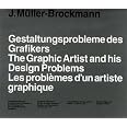
I bought a copy recently and it's like returning to an old friend. I had the original when it was published in 1961 and kept it on my desk at the office. It was always being looked through by colleagues, pages copied, dropped on the floor, borrowed (and luckily returned) but as is the way with office books it eventually disappeared. I was familiar enough with the pages not to buy a copy until nostalgia got the better of me and I thought I really should own a new edition.Despite the contents being over fifty years old what JM-B writes is still relevant today, not in the sense that pages are full of hands-on information, though there is some of that in the text but more a philosophical approach to commercial creativity which is revealed to the reader by studying the displayed work. The majority of this has been created by JM-B during the fifties and nicely cover a wide range of print material. My favorite sections are the series of posters for the Zurich Tonhalle Gesellschaft, these are just timeless designs, the other is the student work in the last chapter, some of the graphic design and typography is quite remarkable.Obviously the digital age was decades away when the book was first published and maybe website designers might strain to find anything of relevance to their creative output but companies still need print: brochures; magazine; booklets; letterheads; reports; packaging; logos and more. These pages will provide the inspiration to design problems.
P**R
Five Stars
Love it... Great for any designer with love of grid
J**Y
Nice swiss lookbook, informative, a few issues
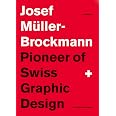
I own Brockmann's full library, and this is one of my favorite books. Insightful, informative, and a great example of swiss design as well a visual narrative of a key graphic designer. In German, English, and French. Topics include importance of content in advertising (type, photography, illustration, color, logo, brand name, uniformity), exhibition work, and more about building process and skill.I do, have a few issues with the book, most of them are in the construction: as this is a reprint done after Josef's death I figure these issues are not related to the original book, more the one sold on amazon. For a book created by the master on layouts, and designing around the consistency of a grid, it's disappointing to see that this book is the only one to have a european spine in his full set. I have a friend with an older copy of the book containing a western spine, which I'd prefer. (I know this is picky, but it's disappointing to see that someone has decided to alter JMB's design, and makes me concerned that other changes were made as well.)Additionally, the unjacketed cover is constructed well, but with poor material choices. A linen paper was used on the cover, which provides an awesome texture, but the paper they used is tragically thin. Because of this, the bright white cover is left with a dirty-looking gray undertone. Additionally I had a hickey (from the printing press). The rest of the book was very impressive. Jacketed cover is also a significantly ligher gray.A definite purchase for ANY graphic designer, also check out Raster Systeme (Grid Systems) by JMB. That book completely revolutionized my designs, and way of thinking. :D
J**H
Five Stars
Loved it.
H**B
Gift for someone
Bought as a gift for someone. They liked it.
Trustpilot
1 day ago
1 week ago